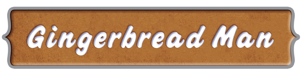
This is the Gingerbread Man Vape flavor I created the brand for. I put a lot of thought into the illustrations and package design. The header above I provided to be used on the site to market the product as needed when it was launched.
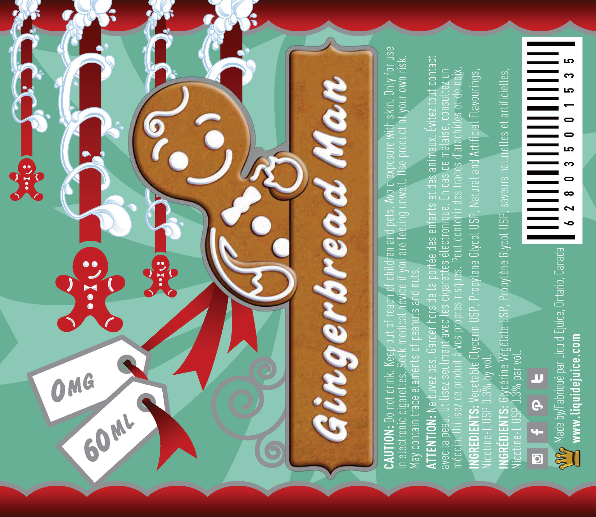
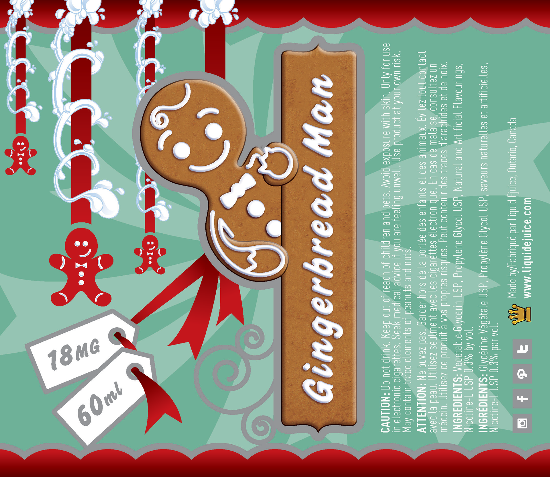
Above, you can see the wraps for the package design. There are two similar designs with subtle changes for comparison. Additionally, there were copy changes for the 0mg and 18mg versions.
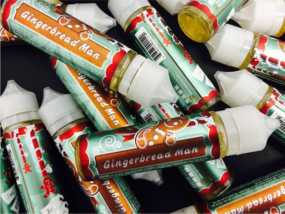
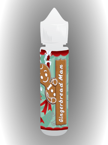
This is the final product. You can see that the grey was changed to be knocked-out, leaving it the white of the label. The rest of the inks were printed incorporating metallics. Eye-catching, as the final packaging.

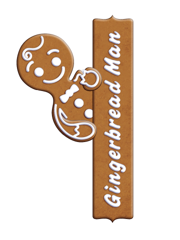

Here are some design elements I created. The far left is a texture I created for the gingerbread used throughout the marketing campaign. Next is a mock-up of the final product. This was also used in some of the posters and handouts below. Next are two versions of the Gingerbread Man, along with the icing text. One version has no outline, while the other has a silver outline and a larger main Gingerbread Man.


Marketing materials incorporating the packaging design included a 5x7 handout, a 2.5x2.5 sticker, and a 35x24 poster. These designs were created using Illustrator, with some elements completed in Photoshop.

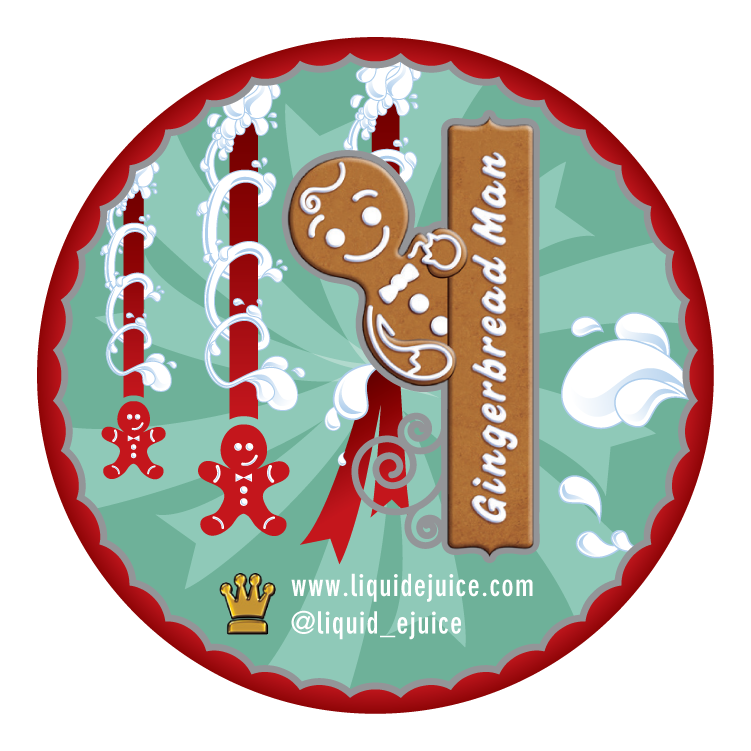
This thin bar was used as a web banner and once again incorporated the entire marketing strategy.